Creating Touchable, Textured Label Designs
What we touch, we buy. Behavioral research (including a study titled "Touch and Go: Merely Grasping a Product Facilitates Brand Perception and Choice") has shown that simply picking a product off a store shelf increases the likelihood that a consumer will purchase that product.
What’s more, people feel more deeply connected to brands when they have a tactile experience with a product. They’re more likely to prefer it over competitors and more likely to purchase again. In fact, a long-term study by university researchers published in 2009 found that customers who could feel a product were more willing to pay more than those who hadn’t.
In other words: We make an emotional connection with what we touch.
The challenge—and opportunity—for brands, then, is to entice consumers to pick up their products. Not just to pick them up, but to run their fingers over the alcohol label design to deepen their engagement.
Catch Their Eyes, Prompt Their Touch
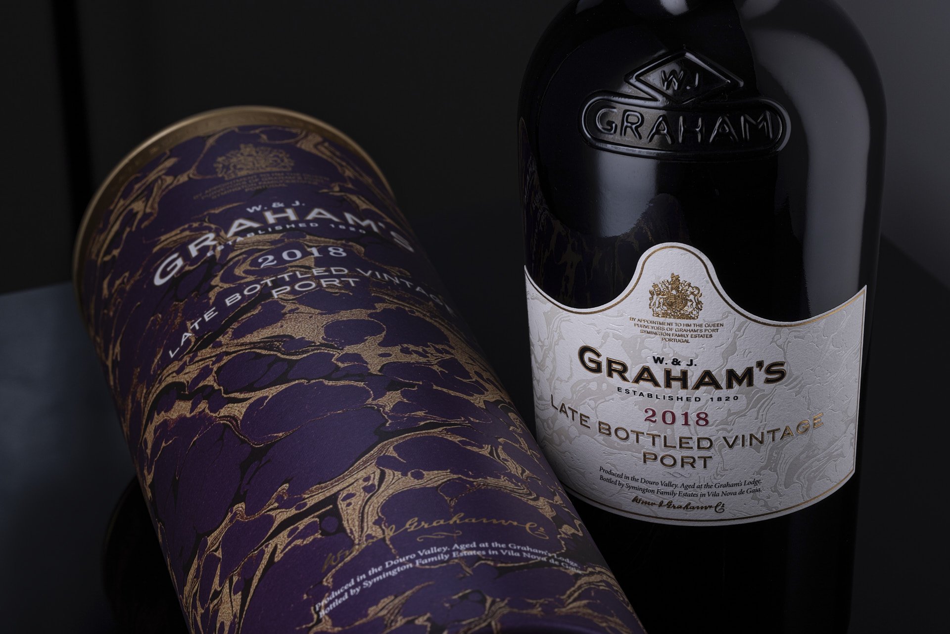
In the wine and spirits categories, smooth paper labels on smooth glass bottles are the packaging norms. In order to create a more tactile experience, premium brands are leveraging textured label design and production techniques to encourage consumers to run their hands over the package.
For brands with ample resources, there is perhaps a better way to invite a consumer’s touch than with a bespoke bottle design that has distinctive shapes and facets. But there are so many ways to embellish stock bottles, starting with paper selection.
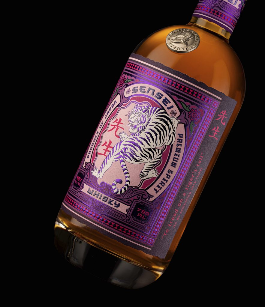
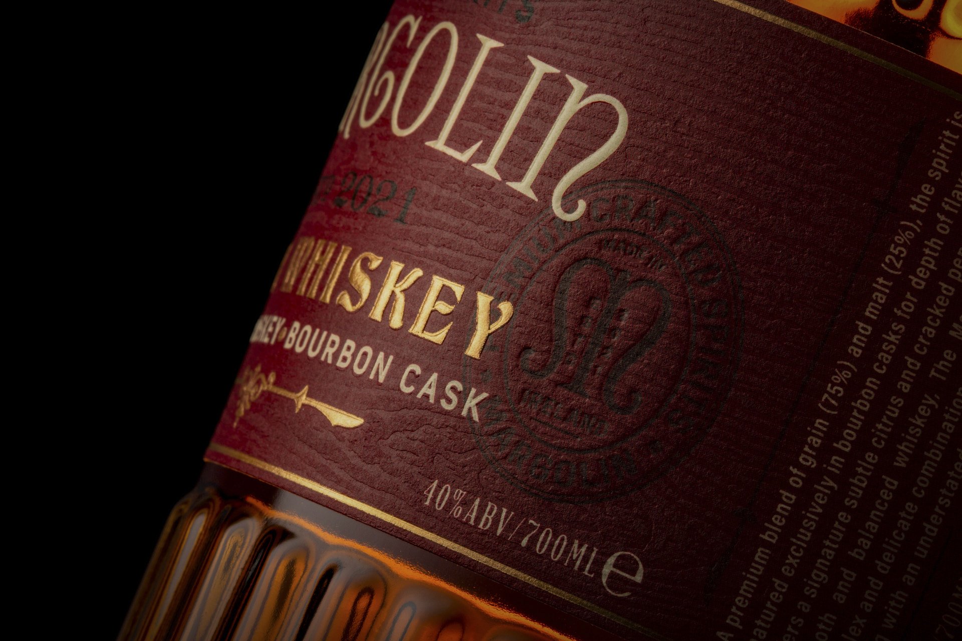
Selecting the ideal paper for a package flows from the alcohol label design itself, and options extend far beyond plain white or cream label stock. Coated or textured paper adds a bit of dimension to the label. You might even choose a paper that incorporates elements like grass or sand from your brand’s home region and celebrates the brand’s story.
Finishing techniques like varnishing and embossing add texture and detail to a wine or spirits label. Embossing creates a raised graphic (debossing, in turn, embeds the design into the paper), while clear, tinted, or iridescent coatings add sheen and vibrancy.
Used together, a combination of these creates an intriguing interplay among the design elements on a textured label, adds visual intrigue, and invites the consumer to run their hands over the package.
Using an unexpected label material can bring an otherwise simple bottle to life. For Triple Six Dry Gin, for example, we designed a metal label in a bronze finish that enhances a standard bottle in black glass.
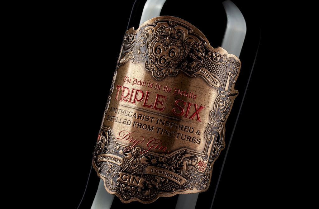
The product is inspired by apothecary botanicals, and the label has an appropriately vintage style, with gorgeous scrollwork, natural motifs, and ancient symbols deeply embossed into the metal.
It was the ideal solution for the brand: The material really shows off the incredible level of detail in the design and the intricate die-cut outline of the label. The brand is available exclusively in clubs, bars, and restaurants, and the bronze label positively glows under ambient lighting. And it appeals to a key customer base for the client—bartenders, who have fallen in love with the product and happily recommend it to patrons.
Materials Elevate Brand Perception
For spirits brands, the bottle is so much more than a container—it’s an expression of the brand’s story. And strategically, it’s a critical component of your marketing efforts, the primary line of communication with the consumer who may meet your brand for the first time on a store shelf. Elegant design and materials for the label, textured or not, increase perceived value immensely, even as your production cost remains manageable.
Once you’ve enticed the consumer to pick up your product, you’ve begun to build an emotional connection to your brand. And then the sale becomes inevitable.
Other useful resources
7 Signs It’s Time to Redesign Your Packaging