
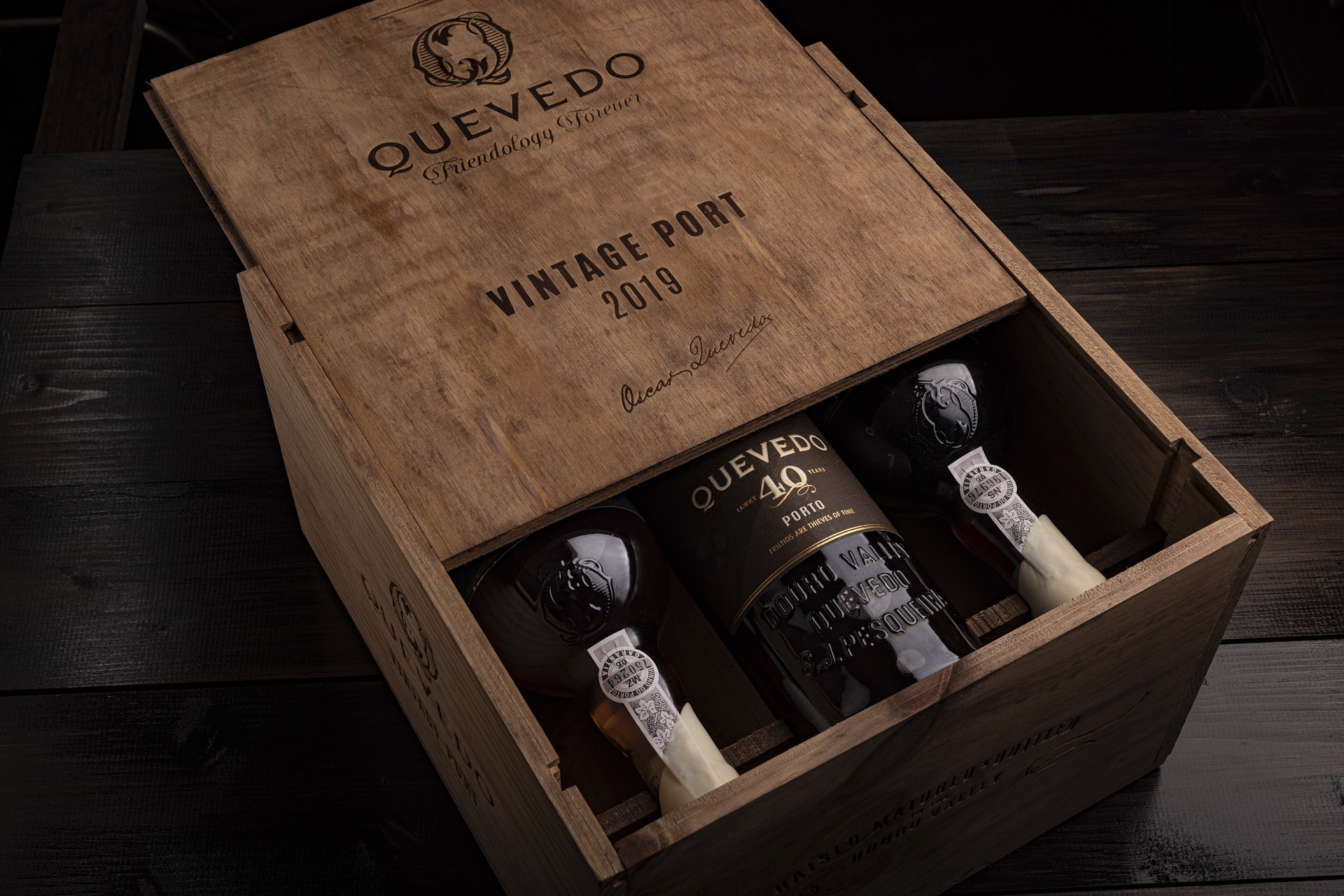
Quevedo Port
Quevedo, a family-owned port wine producer approaching its 30th anniversary, needed to express its friendly ethos while managing a complex portfolio of 15+ products. The challenge was modernizing the brand without losing its heritage appeal.
The Challenge
As Quevedo approaches the 30 years old mark, the team felt it was ripe to further express its friendly ethos and build its personal path. This required a positioning definition with an implementation on a very large range of more than 15 Port wines.
The Challenge
As Quevedo approaches the 30 years old mark, the team felt it was ripe to further express its friendly ethos and build its personal path. This required a positioning definition with an implementation on a very large range of more than 15 Port wines.
Strategic
Approach
We developed a three-tiered portfolio architecture based on consumption occasions:
EASY APERITIFS
- Everyday ports for casual moments
- Light, bright color palette
- Modern, approachable design language
SPECIAL MOMENTS
- Mid-tier range for gifting and sharing
- Rich, vibrant color families
- Enhanced finishing techniques
LANDMARK MOMENTS
- Premium offerings for celebrations
- Deep, sophisticated colorways
- Luxury production values
Creative
Solution
The creative approach was bold as it ditched the incumbent range look which was dark and recessive. Quevedo is about celebrating friendship, so it should be the most colourful Port. Because there nothing that prevents us from doing it: it feels good and will catch the attention of those who are curious and open about easy going ports.
Production
support
Collaborating with industry-leading manufacturers, we managed every technical detail from concept to shelf:
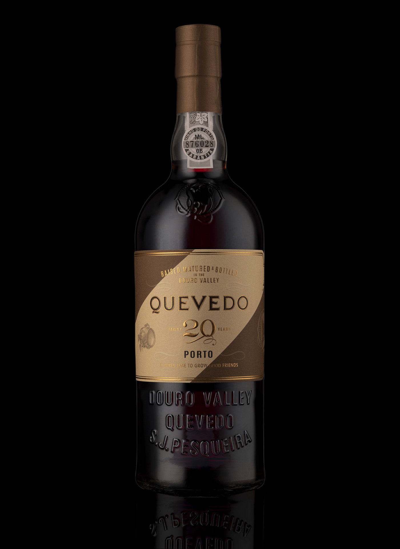
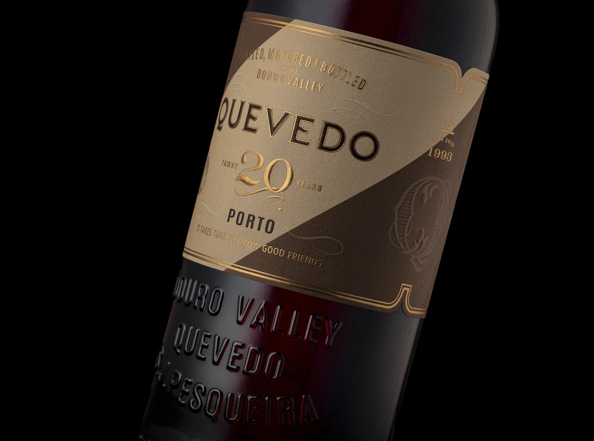
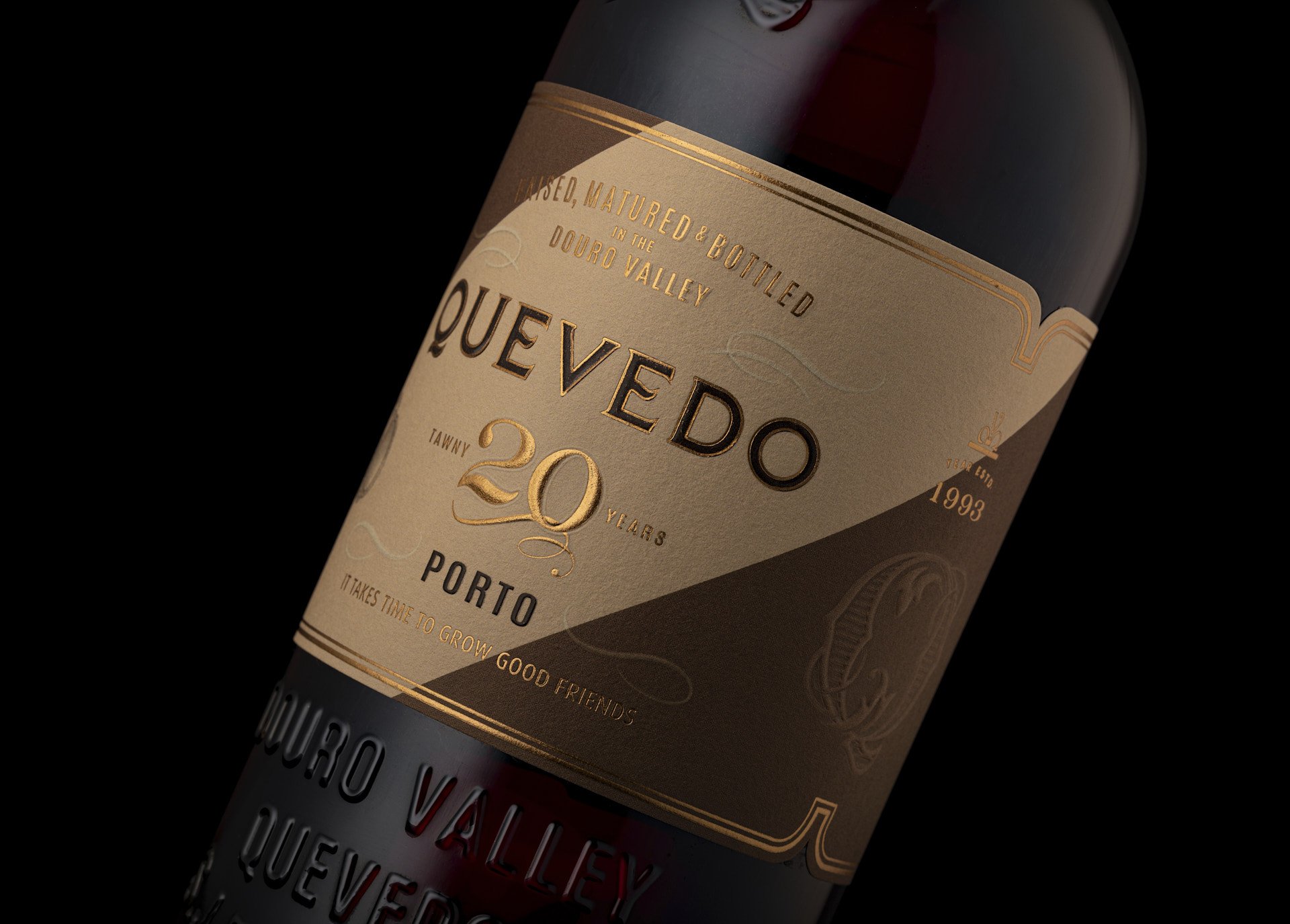
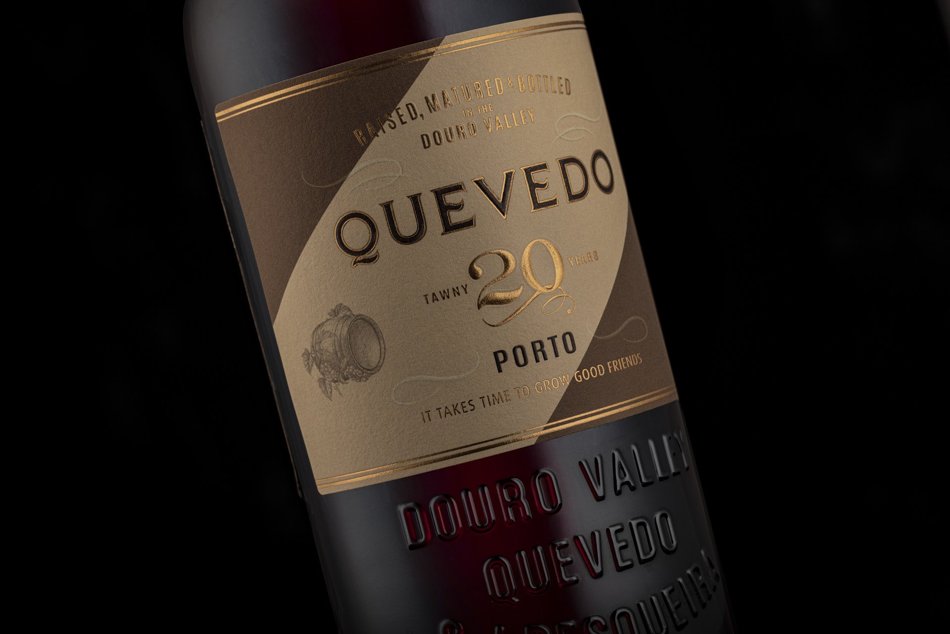
CUSTOM BOTTLE (WITH SAVERGLASS)
- Traditional Port wine silhouette with modern details
- Embossed brand logotype and Douro Valley origin markers
- Multiple prototype iterations and sample approvals
LABEL PRODUCTION
- On-site color pass supervision
- Premium finishes: embossing, hot foil, multiple varnishes
- Quality control and color consistency across SKUs
This hands-on production management ensured the final product matched our design vision while meeting premium spirits standards.
Results
year-over-year sales growth
products with successful implementation
increased shelf visibility and recognition
"Think Bold Studio perfectly understood the direction we wanted to take with the rebranding of our Ports. Every single detail in the new packaging was mastered by Hugo and his team. Our Ports now have a great visual, which makes us very proud of the whole work together."

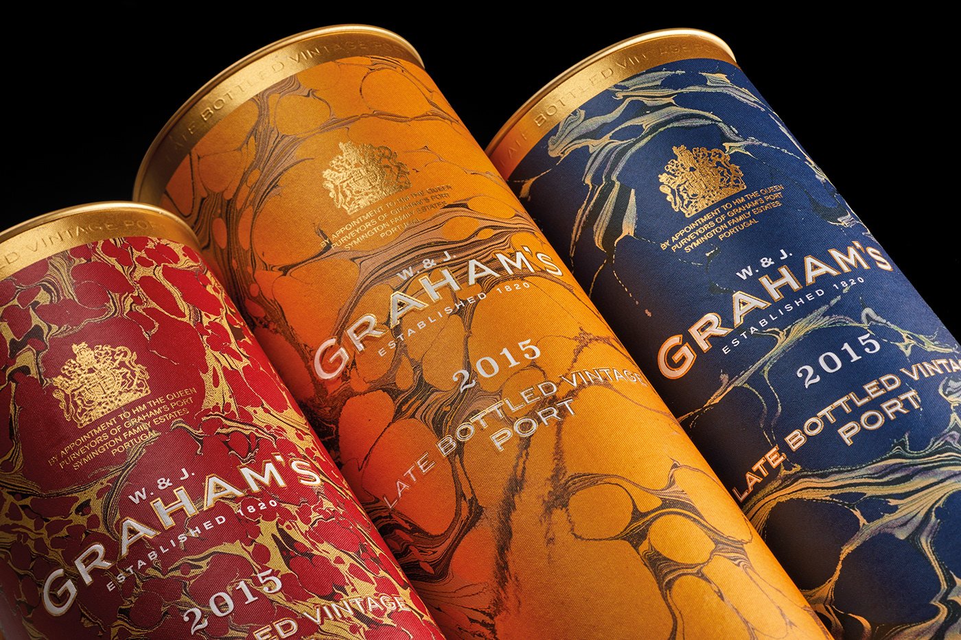
related project
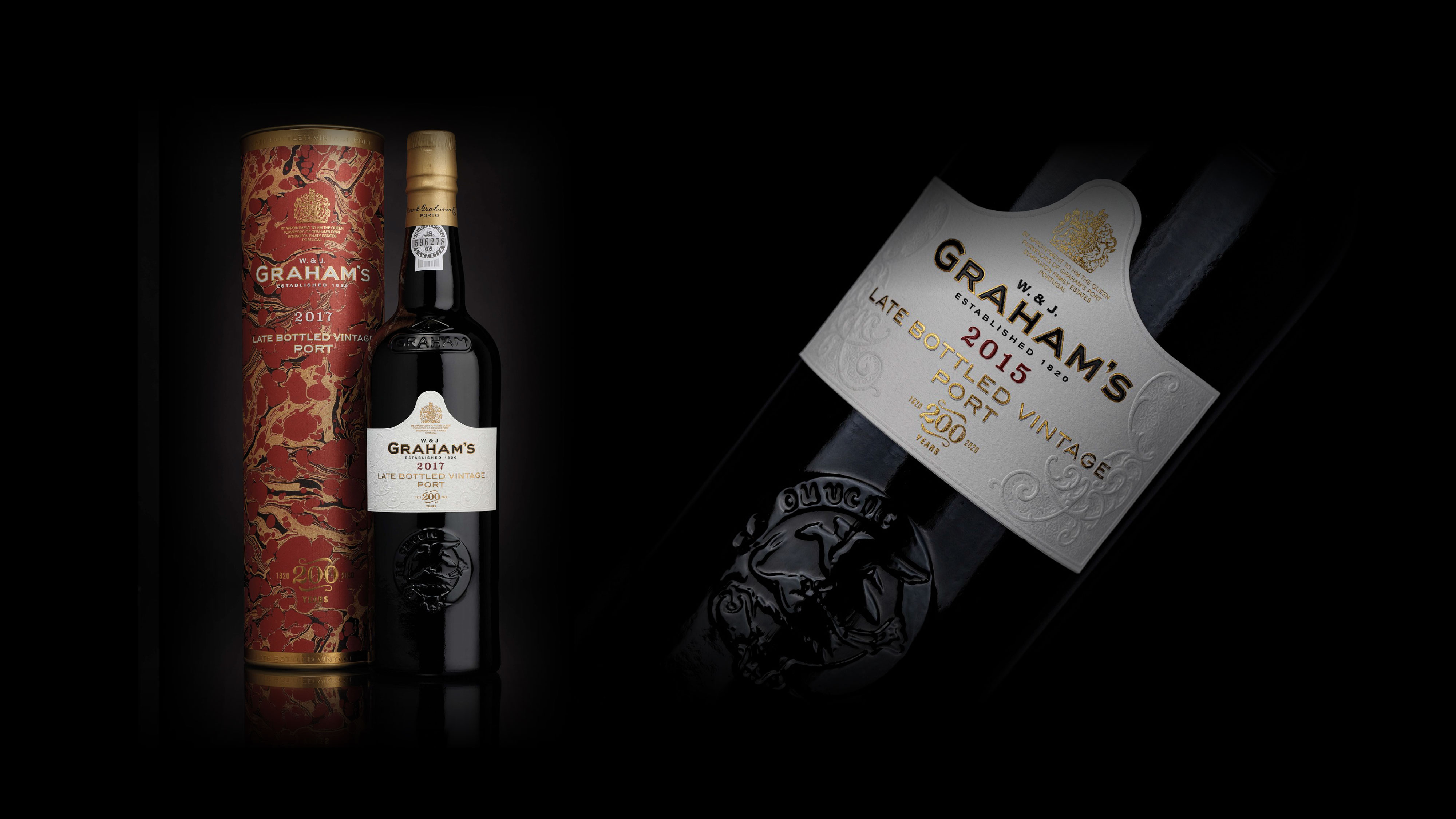
Graham’s LBV
Creating packaging to celebrate the 2015 special edition Late Bottled Vintage Port
sales growth
Ready to Start Your Project?
Let's discuss how we can help your brand achieve similar results.